Review: Sophisticated Elegance – The Blancpain Villeret Quantième Phases de Lune

DEPLOYANT - the watch magazine for collectors, by collectors
Blancpain Villeret Quantième Phases de Lune
Last year, Blancpain introduced the Villeret Quantième Phases de Lune for ladies In the segment of the industry where quartz movements and solid case backs dominate, the watch is a rare breath of fresh air with its automatic movement visible through a sapphire crystal case back On top of that, it is equipped with not one, but two complications, again a rarity as women’s watches tend to be time +/- date only.
This year, Blancpain re-introduces the Villeret Quantième Phases de Lune with several small but impactful changes.
The Case, Dial, and Hands
The most apparent change to greet the new Villeret Quantième Phases de Lune is in its case size Formerly a dainty 29.2 mm in diameter, this year’s novelty measures 33.2 mm – a 4.0 mm increase The effect this has on the watch should not be underestimated, for it is the whole difference between a strictly classic and a contemporary ladies watch.
Indeed, with the size increase, we feel that the Villeret Quantième Phases de Lune is now more in-line with current trends while still maintaining its impenetrable air of elegance The other aspects of the case (design and finish) remain unchanged.
In spite of a 4 mm increase in diameter, the case retains its elegance and should still fit all but the smallest wrists.
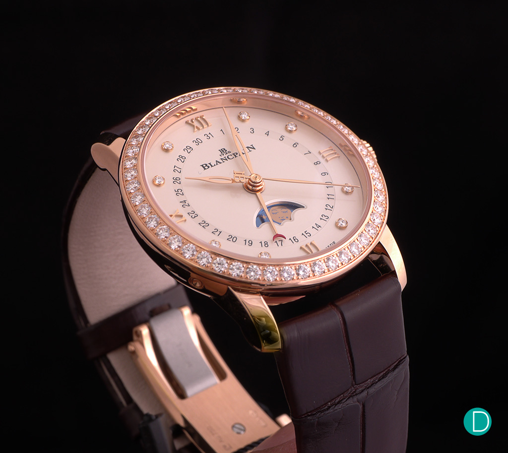
The dial has also seen only minimal changes The moon phase display is still the highlight of the dial.
A little trivia: the moon phase indication was a complication that had almost vanished from the scene until Blancpain reintroduced it back in the early 1980s; since then it has become somewhat of a signature of the manufacture Visible through a bosom-style aperture, the moon on the disc is graced with a feminine face with an artificial mole or “beauty spot” (also known as a mouche for its similarity to a fly) Appearing at the corner of its smiling mouth, it was regarded in 18th century France as symbolising a playfully teasing attitude.
Mouches were used by ladies of the court as a message to their suitors that differed according to where these coquettish signs were placed.
The second feature on the dial is the radial date display indicated by a red crescent-tipped hand Where previously it was punctuated by dots (replacing even number dates), every single date of month is now printed on the dial Another subtle difference is that the date track appears to be on a different plane to the main dial resembling a shallow trench.
The hours are marked by applied Roman numerals (for 12, 3, 6, and 9 o’clock) and diamonds, the same as last year’s reference The hour and minute hands, while still leaf-style, are now hollowed, while the seconds hand, formerly lancet-style, is now leaf-style as well and counterbalanced by Blancpain’s ‘IB’ logo.
Collectively, these changes have subtly modernised the watch and added an extra layer of sophistication to the design and aesthetics of its visage The outcome is positive, but that doesn’t mean its predecessor is left in []
The post Review: Sophisticated Elegance – The Blancpain Villeret Quantième Phases de Lune appeared first on DEPLOYANT
. Source